For the last month, my Craftcourse partner Emily and I have been scheming up a light, bright revamp of her living room. Emily had already gotten some bigger furniture pieces, but as they say, the devil is in the details - particularly with home decor. When HomeGoods offered me a gift card to make someone happy, I knew this was the perfect opportunity to get the finishing touches on Emily's living room (and of course, make her happy in the process). You can see our inspiration in this post from last month. Well, we finished 'er up this weekend, and I've got to say that I'm feeling a little jealous of her new space!
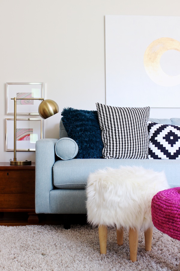
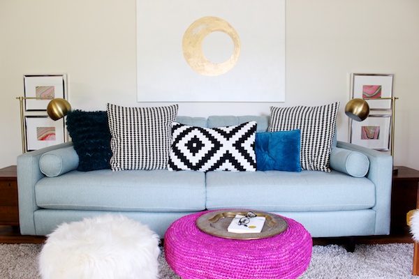
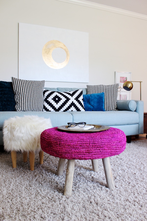
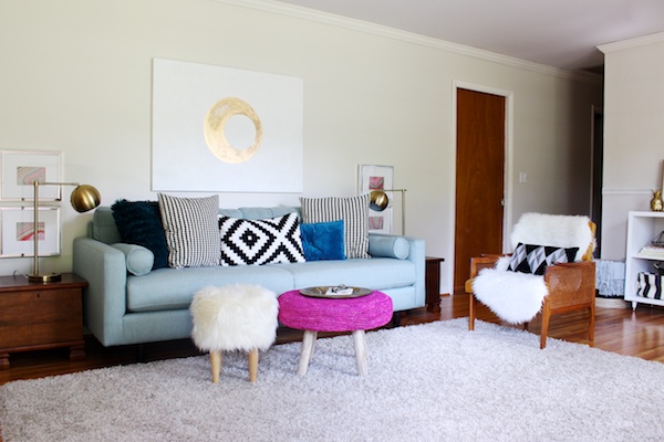
One of our biggest challenges in the room was what to do with the vast expanse of space above and around her sofa. Emily gave a blank canvas some nice texture with white acrylic paint, and then, we added a super simple geometric shape with liquid gilding. One mistake a lot of people tend to make is hanging their sofa artwork too high, and it ends up not really relating to anything and somehow makes a blank wall look even blanker. This is why we hung the artwork just a few inches above the sofa, and let the wall above the artwork do its job of making the space light and airy.
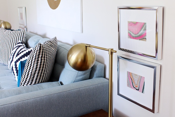
Next, we picked up four shiny, silver frames from HomeGoods and loaded them up with this beautiful pink marbled paper. We hung them super low just above the side tables and behind the accent lamps. By hanging them this way, they serve more as table decor (but without the clutter) than wall decor...if that makes sense. If we'd hung them higher and more in relation to the big artwork, not only would they look way too puny for the wall but, because they help balance the weight of the side tables, the skinny lamps would also look far too small for those substantial storage tables.
The sofa area also got a couple of versatile ottomans. Emily's son is about to turn three, and so she wanted to keep the area open and free of hard edges for tons of playing. These ottomans - especially when paired with a tray - can serve the same purpose as a coffee table but are soft and can be moved around. We're also pretty much OBSESSED with that pink Cynthia Rowley ottoman we picked up at HomeGoods. We wanted some pink in the room, and this is the absolute perfect pop that also brings an eclectic vibe with its woven texture and drift-woody legs.
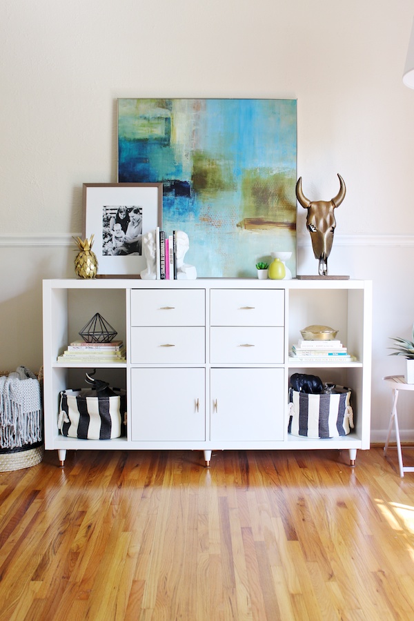
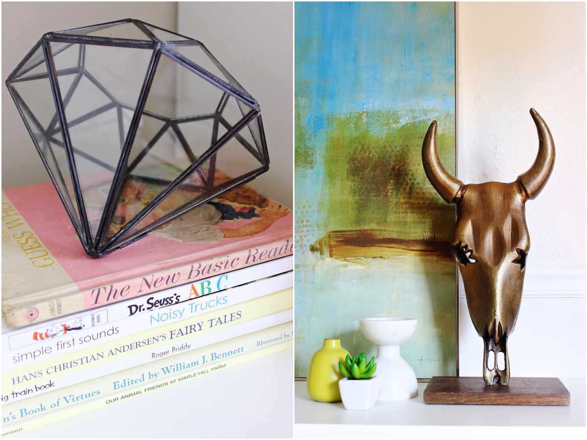
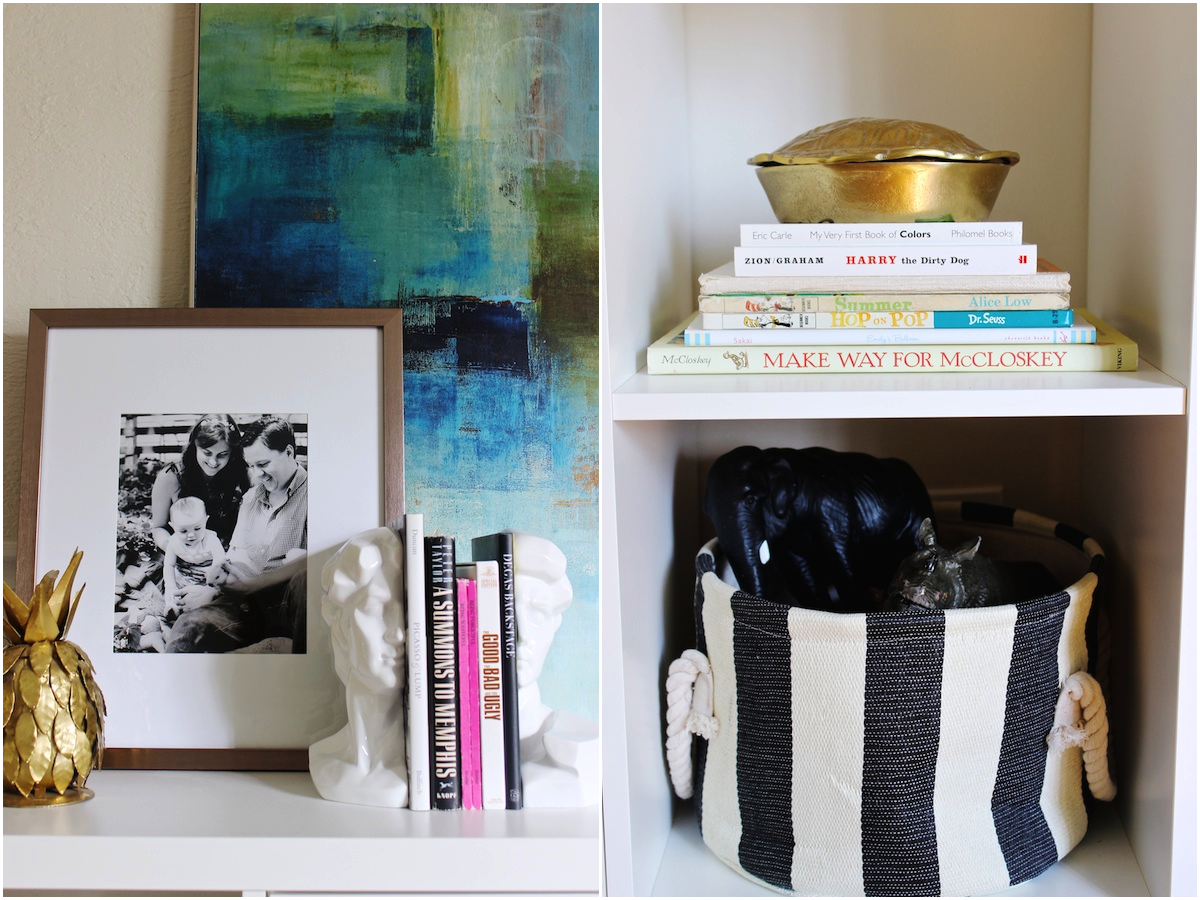
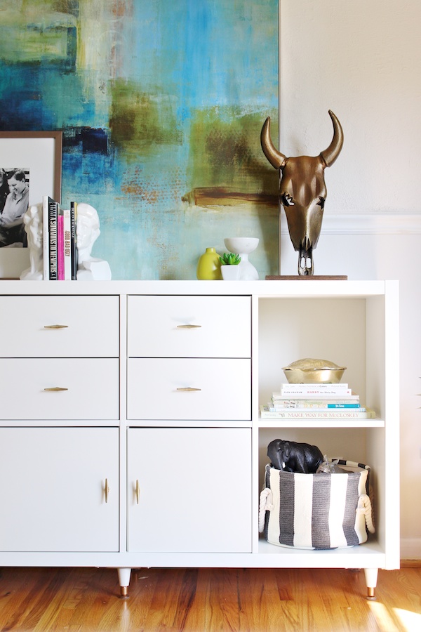
This console area is probably my favorite part of the room. It's also so kid-friendly it's ridiculous. The drawers, cabinets, and baskets all give Emily a place to hideaway all of her son's toys. Heck, we even displayed children's books in the extra cubbies. And I love, love, love the accessories...almost all from HomeGoods. Instead of hanging that incredible painting (from HomeGoods and fortuitously in our color scheme), we just leaned it against the wall, and then worked our way down in height with another frame loaded with a family photo, that awesome metallic cow skull sculpture, those modern David bookends, and a few small accessories -- nearly all from HomeGoods.
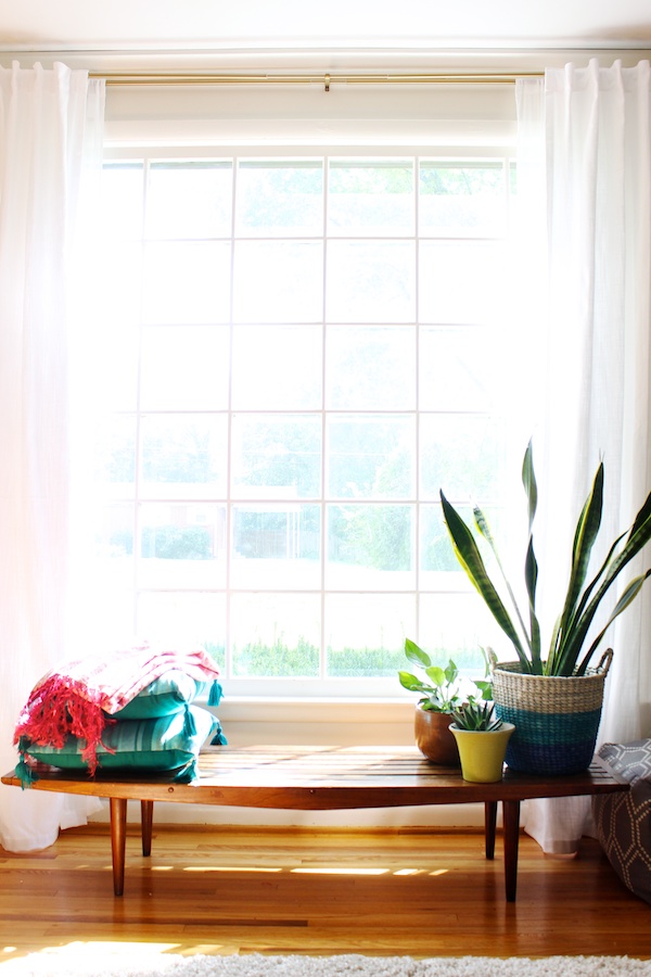
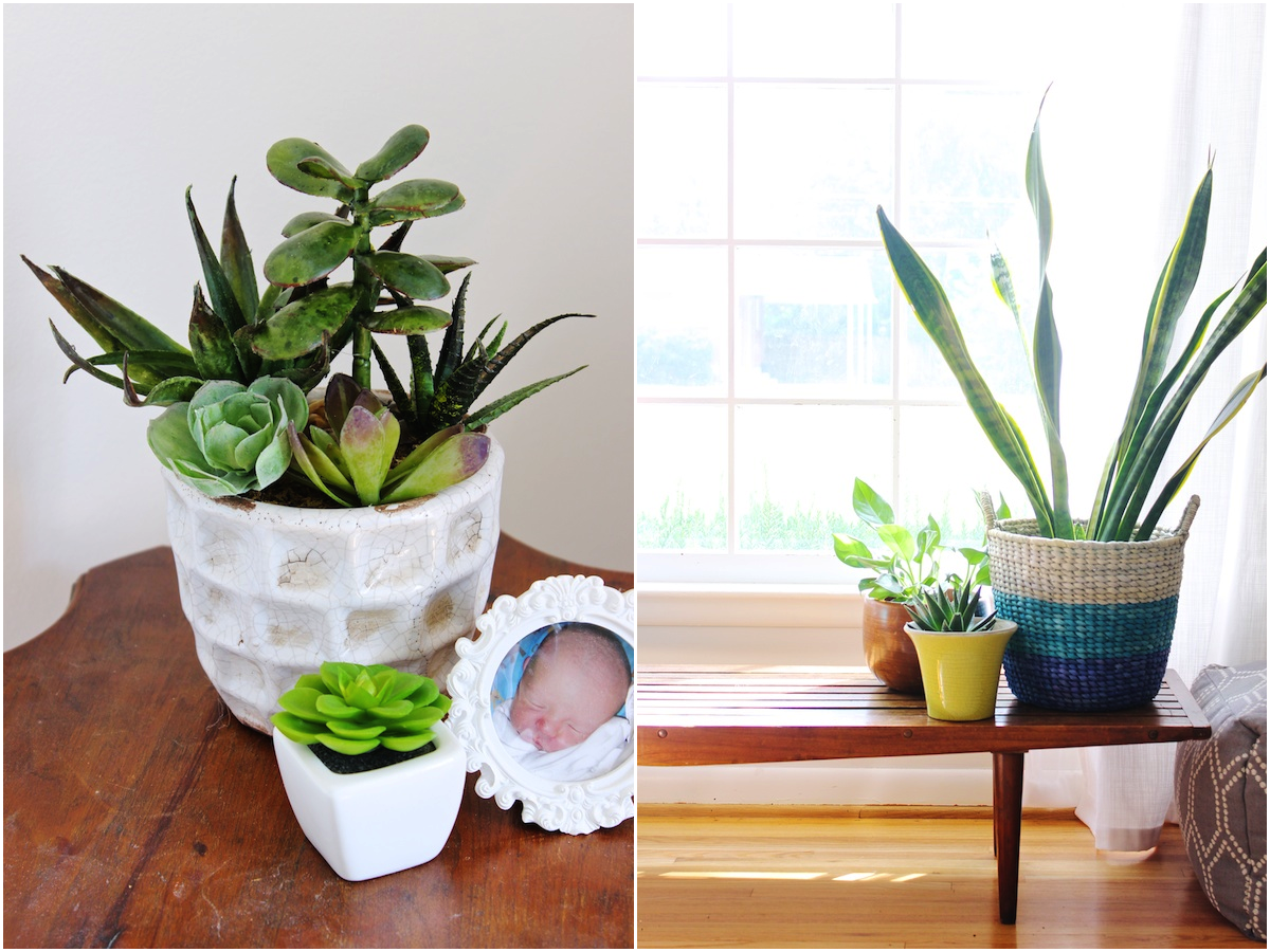
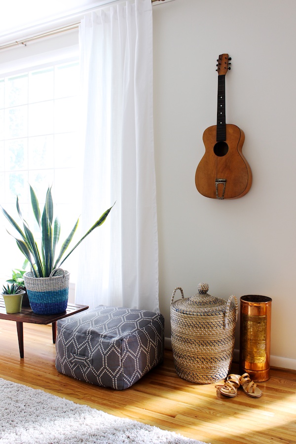
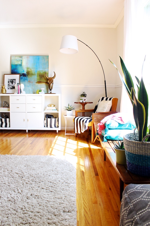
One of the best features of Emily's living room is this incredible window. We didn't want to block the gorgeous light from it, so we brought this low mid-century bench in from her bedroom and used it as a spot for a few plants and pillows. Apparently, it's also the perfect racetrack for her son and his toy cars. Oh and, true story, HomeGoods has a fine selection of artificial plans if you've got a black thumb. Can you guess which of our plants are artificial?
A big thanks to HomeGoods for helping me make Emily happy and, of course, all the amazing goods that made this room possible!
Disclosure: HomeGoods gave me a free gift card to help Emily decorate her room. All opinions are my own.
Disclosure: HomeGoods gave me a free gift card to help Emily decorate her room. All opinions are my own.

love it! especially the console :)
ReplyDeleteWe have the same rug. How do you take care of it?
ReplyDeleteSaw that pink ottoman at my homegoods & fell in love. The space looks incredible!
ReplyDeleteLooks amazing! :)
ReplyDeleteI love that console! Where did you get the hardware you used on it?
ReplyDeleteThanks! I believe Emily got the hardware from Anthropologie.
DeleteYour console is perfect! I love the touch of gold. Where did you get the hardware?
ReplyDeleteThanks! I believe Emily got the hardware from Anthropologie.
DeleteWhere did you get the console
ReplyDeleteHi, Linda! It's just the Kallax (formerly Expedit) unit from Ikea with their coordinating doors/drawers, legs from Home Depot, and hardware from Anthropologie added.
DeleteHi can you tell me anything about the earth tones artwork above the console? artist? title? I love it.
ReplyDeleteWhere did you get those gold lamps?
ReplyDeleteMandy - I am obsessed with what Emily has done with the Kallax! Do you happen to know which legs from Home Depot she got & how she upgraded them? (Paint, stain, etc)
ReplyDeleteWhere is your sofa from?
ReplyDelete