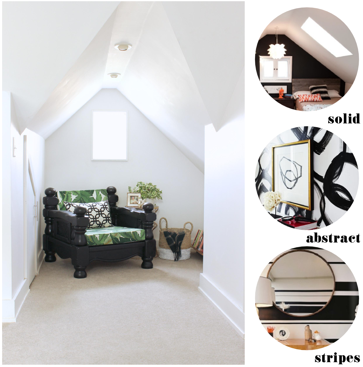
On Monday, I shared the current state of my bedroom reading nook and mentioned that I'd like to bring some paint into it somehow. You see, painting in our bedroom is tricky. There are eaves on eaves and angles everywhere, and because our bedroom is sort of lofted and open to the downstairs, the walls extend into the stairwell and even down into the living room. See. Tricky. Once you put paint on one wall, suddenly you're painting half of the house -- ceilings, rafters, and all. I actually love the white in this space and am mostly fine with leaving well enough alone, but I would love to have just a little something in this nook to set it off and accent those cute little angles.
Sherwin-Williams asked me to share my color resolution, and with most of the house freshly painted, my color resolution is rather small and involves the very absence of color. I'm thinking of bringing some bold black paint into this little space. I've narrowed it down to a few potential approaches for the wall around the little window:
I think I'm leaning towards the least exciting of the three options, but I'd love to hear your opinion on what I should do! Seriously. Help me.
Oh, and if you follow Sherwin-Williams on Instagram and/or Twitter and share your color resolution with the tag #mycolorresolution, you could win two gallons of paint! Check out all the details here.
Disclaimer: I'm receiving some free paint and supplies from Sherwin-Williams for sharing and making my color resolution a reality (yay!). All opinions are my own.
Sherwin-Williams asked me to share my color resolution, and with most of the house freshly painted, my color resolution is rather small and involves the very absence of color. I'm thinking of bringing some bold black paint into this little space. I've narrowed it down to a few potential approaches for the wall around the little window:
- a simple black accent wall (image via Dyanne Wilson Photography)
- something bold and abstract like those brushstroke circles (image via Ferreira Design)
- something bold and geometric like those irregular stripes (image via Lonny)
I think I'm leaning towards the least exciting of the three options, but I'd love to hear your opinion on what I should do! Seriously. Help me.
Oh, and if you follow Sherwin-Williams on Instagram and/or Twitter and share your color resolution with the tag #mycolorresolution, you could win two gallons of paint! Check out all the details here.
Disclaimer: I'm receiving some free paint and supplies from Sherwin-Williams for sharing and making my color resolution a reality (yay!). All opinions are my own.


stripes! love the stripes!
ReplyDeletedefinitely a fan of the black wall, the other two might compete too much with your fun reading chair fabrics
ReplyDeleteI love the solid. I might like the stripes, but I can't decide if it would look right on an asymmetrical wall.
ReplyDeleteI have to admit I was initially drawn to the abstract circles, but in reality if it were me I'd probably go with the solid. Love the nook and the house!
ReplyDeleteI think the stripes will change the space in a not-so-busy way.
ReplyDeleteAnd btw I'm loving your chair!