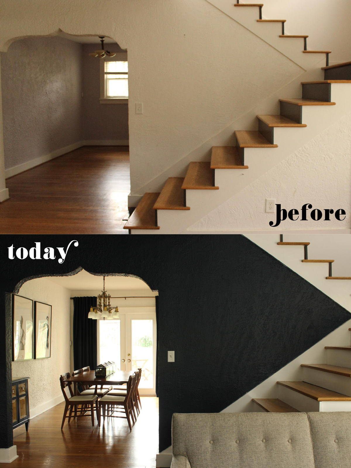
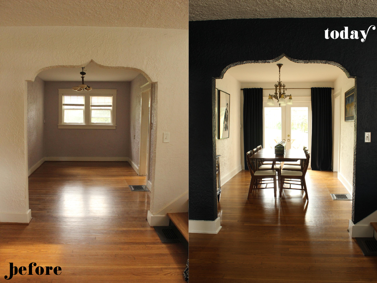
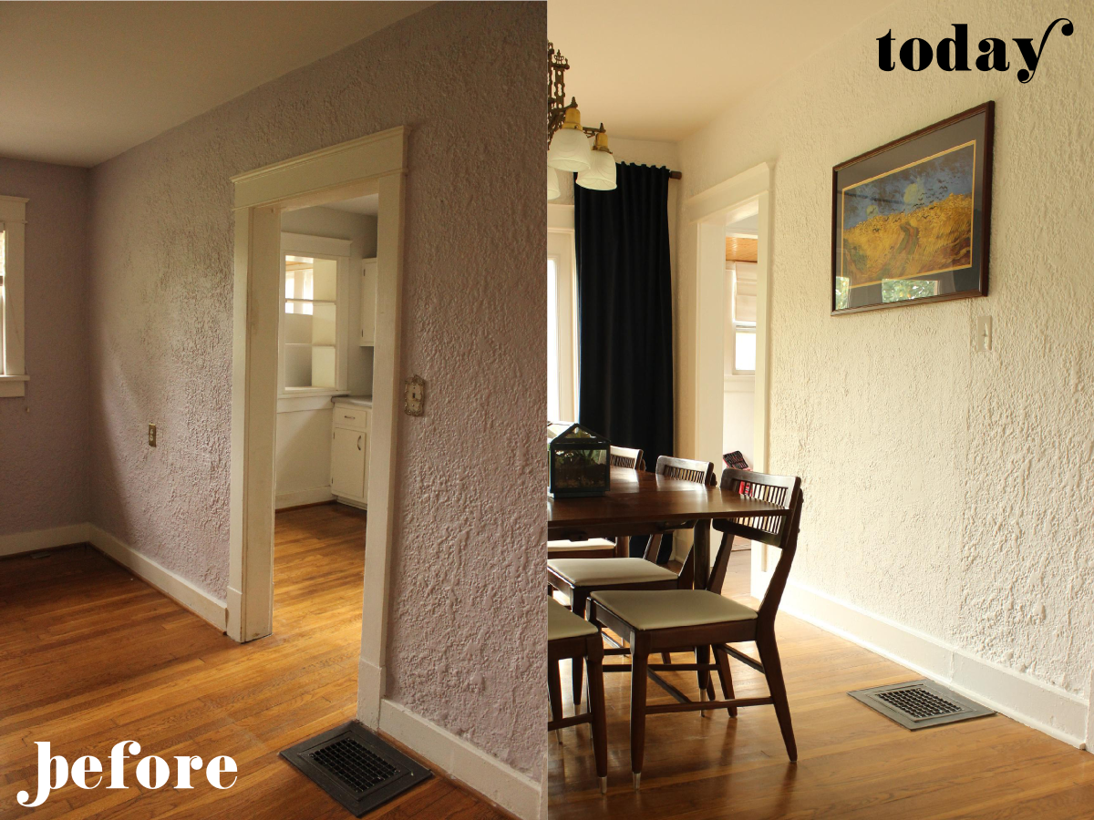
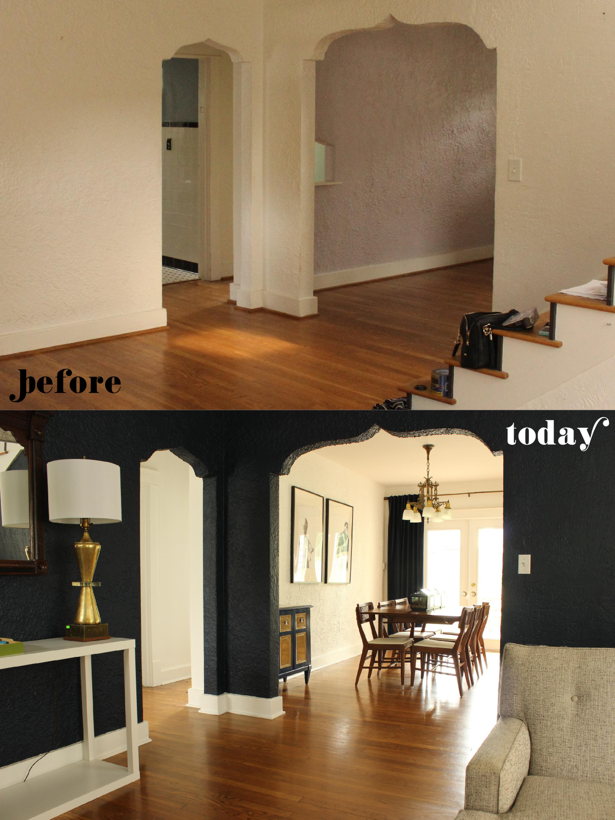
Behold: My dining room is complete! We are officially four weeks into this place now, the dining room is, in fact, only one of two rooms in the entire house that I would deem "complete." There was actually quite a lot that got done in this room. Simple stuff that we've done in the last four weeks like changing the lavender paint to white, switching out the broken light fixture, and of course filling it with furniture. There was, however, some decidedly more complex stuff that we had done in the weeks prior to moving in like relocating the door to the kitchen and replacing the windows with French doors to our backyard. Read on for more details and lots more side-by-sides.
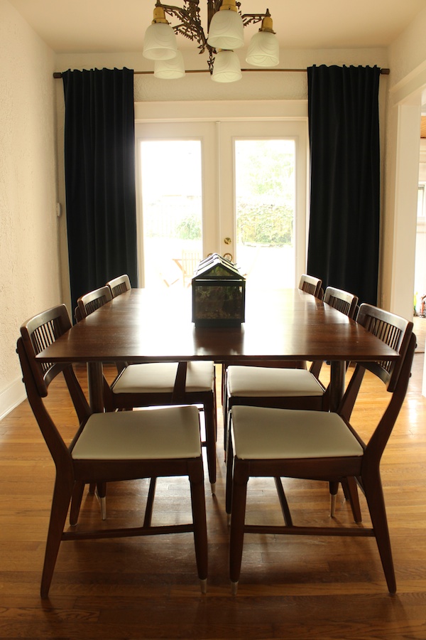
This little midcentury dining set was our first big furniture purchase for the house, since we've obviously never had a dining room of our own. We got them for a steal at a local antique shop, but they definitely required some TLC to bring them back to their glory. I'll share a little more about that adventure tomorrow.
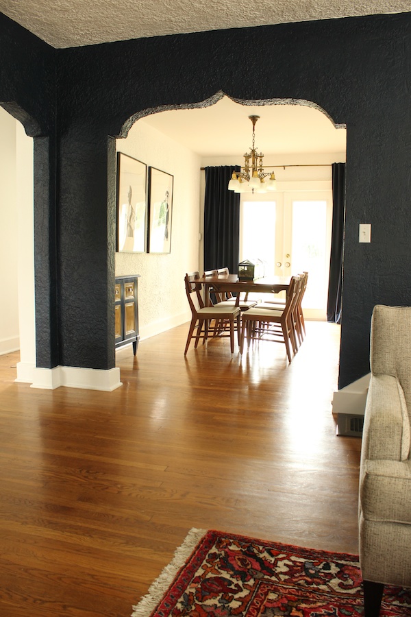
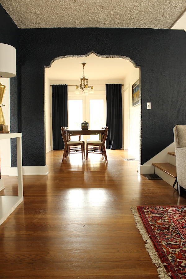
As you can see, replacing the windows with a set of doors not only gives us great access to our backyard, it also brightens everything up. The combination of a new white paint job in the dining room and hallway with a dark navy one in the living room helps play up those arches. And I had no idea that the navy paint I chose would be the same color as the velvet navy curtains I brought in from our old living room.
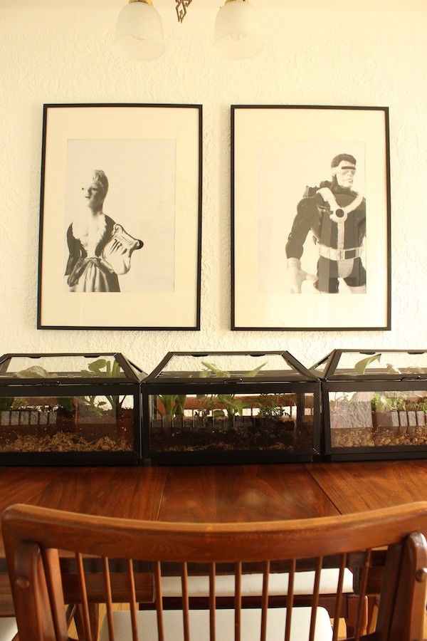
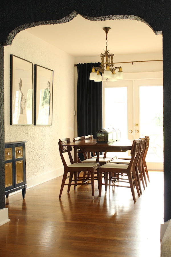
I used the same big art from the old place and added a series of terrariums down the middle of the table to throw in a little something organic but impervious to Pete (the cat).
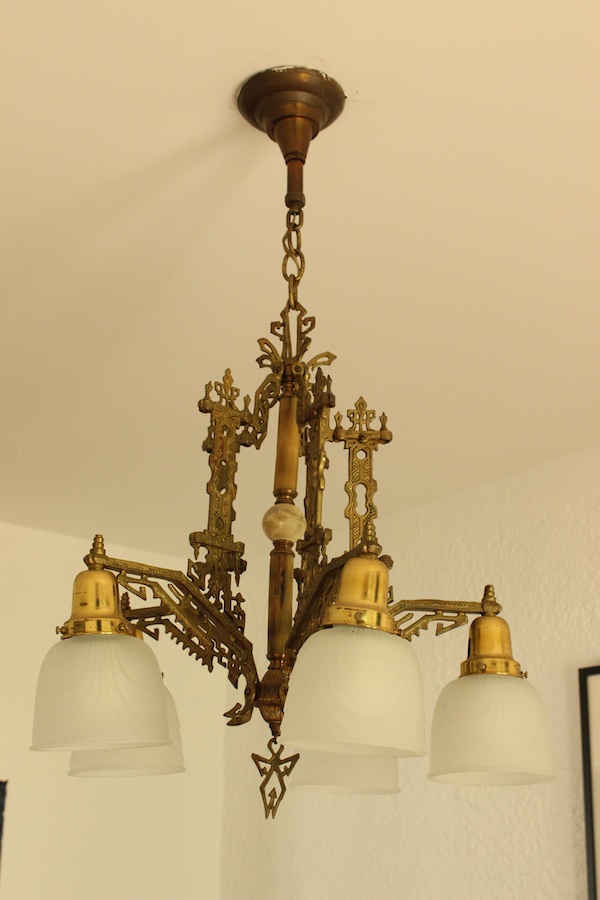
The chandelier was a gorgeous gift from my mother-in-law. They'd bought the Eastlake Victorian stunner for a previous home, but it had no place in their current one. I was more than happy to give it a new place to live! I like the contrasts of its drama and detail with the white walls and modern furniture and art.
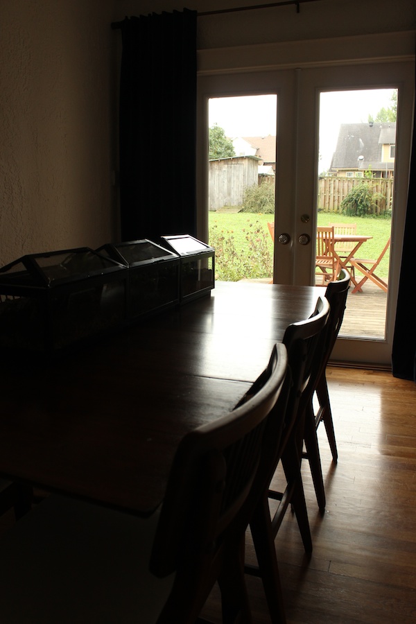
And to get the full effect, see the charming little backyard view now afforded to us thanks to the doors!
I love so many things about this house, but I know this is going to end up being one of our most special rooms. Maybe it's because we've been deprived of a dining surface for the last six years, but we have, no joke, eaten every meal in at this table. Of course, it doesn't hurt that you can see the TV from the table. But whatever.


Greetings from furloughland! The dining room is looking good! Also, I spy a bottle of blanton's on the bar-- we visited their distillery in a southwest ohio/kentucky trip this spring!
ReplyDeleteI love the navy. It's probably one of my favourite paint colours right now!
ReplyDeleteIt looks amazing!!!!! YAY love navy
ReplyDeleteLOVE! soooooooooooo in love with this.
ReplyDeleteIt looks amazing. I cannot wait to see it in person.
ReplyDeleteWow, those curtains ARE a perfect fit to the color scheme! And the terrariums turned out so lovely...I know you're getting early-onset arthritis, but what a transformation!
ReplyDeleteBeautiful! I love the dark walls!
ReplyDeleteOh my gosh, Mandy! We should have been roomies! I love everything you've done, and that big gold lamp on the white table is stunning! I may go overboard with the exclamation marks!! I know you must be ecstatic!
ReplyDeleteLove the mix of old and new. I did that in my dining room and every time I look in there I smile. Is that a little pass through above the bar. CUTE!
ReplyDeleteSo beautiful! Love the deep moody walls and clean minimalist design. So glad to be a new reader.
ReplyDeleteThe difference you've made is incredible. I love how the navy brings out those beautiful arches. Keep up the great work!
ReplyDelete