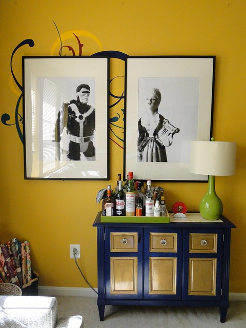
We got a little new bold/quirky/awesome artwork this weekend. Read on for the full 4-1-1 on my inspiration, the subject matter, and the laughably cheap cost.
Let's first discuss my inspiration. More and more, it seems, I've been seeing seemingly larger-than-life artwork -- artwork that is wildly out of proportion within its setting, but because of this, it looks amazing. I really wanted to give this a try in our home, but there's already so much color in our living room that I thought it would be most striking to keep it monochromatic -- thus the black and white photography.

Large Proportions: 1/ Designer Kishani Perera via Mix and Chic, 2/ Designer Stephen Knollenberg via Decor Happy, 3/ via Oh I Design, 4/ The Cross Decor and Design via Apartment Therapy
B&W Photos: 1/ Design Manifest via Houzz, 2/ The Brick House via Spicer and Bank, 3/ Photographer Felix Forest via Bright.Bazaar, 4/ Design Editor
If you want to see more artwork inspiration, check out my Pinterest board and my Houzz ideabook.
Those last two there are the ones that really finalized how I would approach this. I just love that photograph of the rabbit on a completely plain backdrop by photographer Felix Forest. It's so striking, and then that photograph of the camera -- which was blown up as an uber-cheap engineering print at Staples -- looks almost like a sketch and even sort of surreal with the plain backdrop and low print quality. So, I was sold -- interesting object, plain backdrop, cheap engineering print.
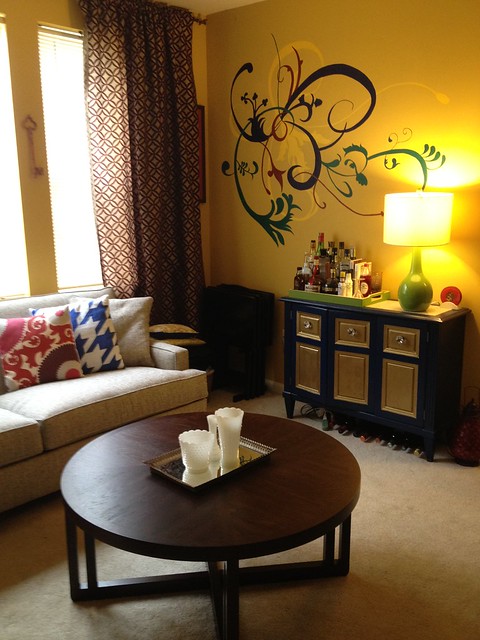
Although not a completely current representation, this picture is basically where we started (sans all those pillows and those patterned drapes). I love my mural, don't get me wrong. But I've had it for over 4 years, so I'm mentally okay with letting it go for something new.
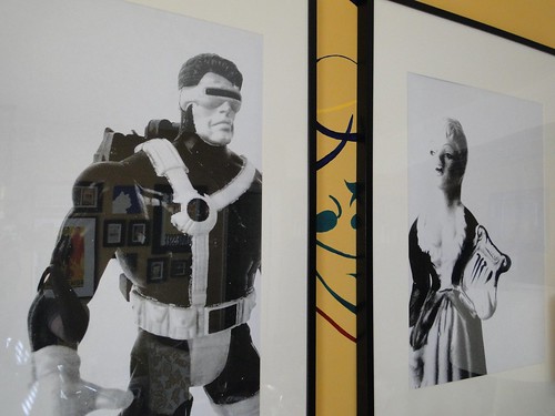
Of course, there was still the dilemma of my subject matter. Everything else on our walls is personal or has a story behind it, so I figured this art should be no different. I decided that perhaps I could use our trip home as an opportunity to photograph a few momentos from each of mine and Michael's childhoods. Michael was an enormous geek (trust me, I've known this guy since he was 7), so he chose a few of his beloved (and eerily preserved) action figures. I discovered that we didn't keep any of my childhood toys (which would have probably been comprised almost exclusively of bald Barbies), but this little figurine used to sit by my bed as far back as I can remember.
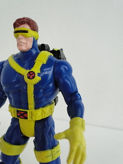
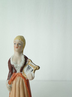
Then, I cropped, flipped, and edited the photos.
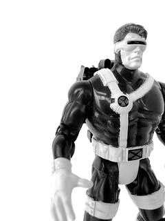
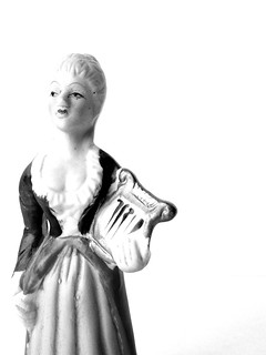
Next, I sent them off to Staples to be blown up as 24" x 36" engineering prints, which set me back literally $3.29 a piece (plus a $5 fee to pick them up the same day). I was incredibly pleased with how the print-outs turned out. Engineering prints are basically like photocopies on enormous copy paper. So, they're grainy, and the paper is fairly thin. I actually thought the graininess worked in my favor. Like the camera photo above, it gives them sort of a surreal quality.
Once I had them in hand, I popped them in two of the biggest Ikea frames I could find (which were around $25 each) and slapped them on the wall.
I love them. They're bold. They're playful and quirky. They're personal and one-of-a-kind. And they definitely make an impact. I think Michael is still a little scared of them. He wasn't even close to convinced of the idea until they were literally on the wall. Like every other bold change in our home, though, I feel confident that he'll warm to them soon...I mean, he should. His wife is letting him have an enormous picture of Cyclops in the living room. What more could he ask for?!

Um, it is impossible to photograph these without a reflection, so use your imagination, please.
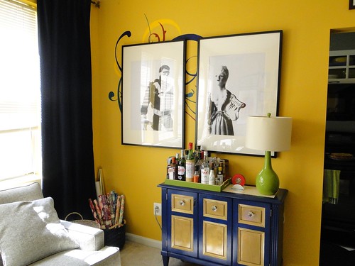
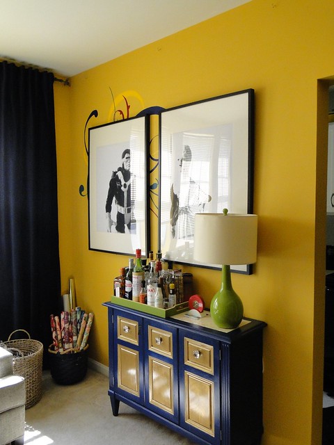
Obviously, I haven't gotten around to sanding and painting over the mural yet; although, I'm not utterly convinced that I need to. What do you think? Does it look stupid back there, or is it adding a little something?

find me elsewhere

I like the quirky nature of the mural crawling out from behind the pictures. I say leave it.
ReplyDeleteLoooovveee the idea...very thoughtful and hilarious. Mine would probably have been Teddy Ruxpin! These could be transplanted to your kid's room you know, in eight years. From the first photo I thought you intended to leave the mural which I felt was a sweet effect. You can always paint over it in a few months if it gets old...
ReplyDeletei love this idea! our problem is that we don't have any large wall spaces left. we have a painting that came down during the kitchen reno that still has no spot. if i *did* have space i'd blow up photos of the cat and dog.
ReplyDelete