Anyway, let's take a look at what I'm starting with. If you go back to the early days in the condo, it was sparse as can be, fairly random, and highly impersonal.
And most recently, I just recycled the family photo display from our wedding.
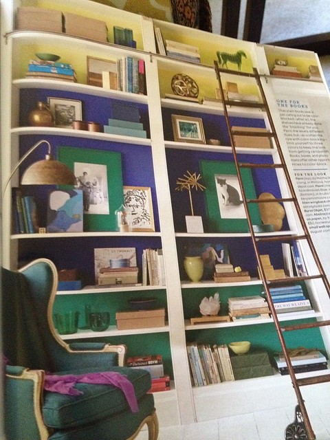
So, I approached it with a fresh eye (i.e. an eye towards copying the configurations in the Living photo) and no new resources to speak of. To be very fair to me, I own very few decorative tschotskes. Michael has no patience for such tomfoolery, and there are few Pete-proof places in our home for such things. So I had to resort to raiding my craft closet to create these "collectibles." I think I did a pretty okay job considering my skill level and lack of resources. Bonus: I actually think it fulfills its utilitarian role more than it did before as it now actually houses some books.
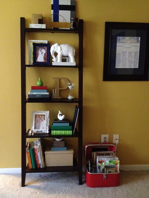
A quick run-down of the tschotskes I was able to utilize/create from non-tschotskes...
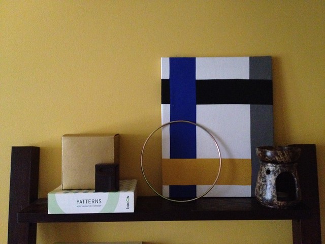
Some Ikea home decor fabric wrapped and stapled around an uber cheap frame, a gold craft ring, a kraft cardboard gift box painted gold, and a letterpress P that we picked up on our trip to London last Fall.
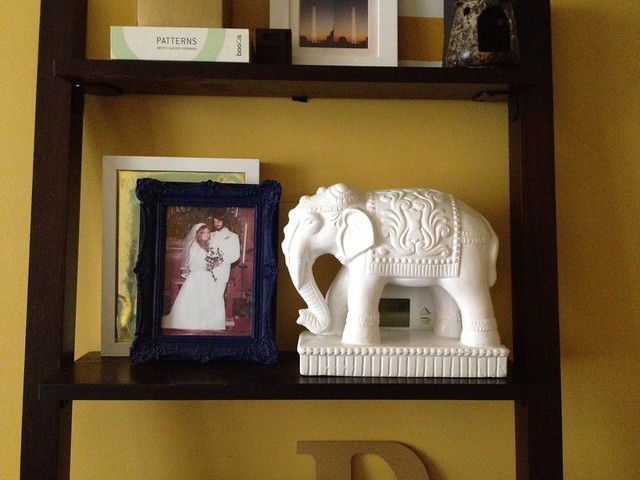
A pic of the in-laws at their wedding, a $7 ceramic elephant from Ross, and a frame with gold wrapping paper.
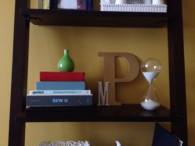
A large MDF letter painted gold, a little wooden letter painted white, a cheap hourglass from Home Goods, and some books and photo albums.
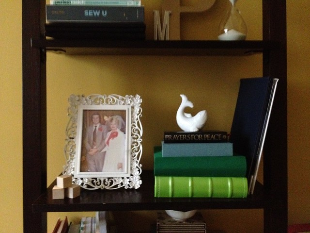
A pic of my parents at their wedding, some wooden craft blocks, a salt shaker, and more books and photo albums.
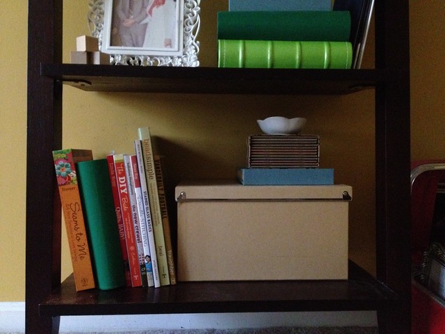
Books, storage box, and a condiment bowl.
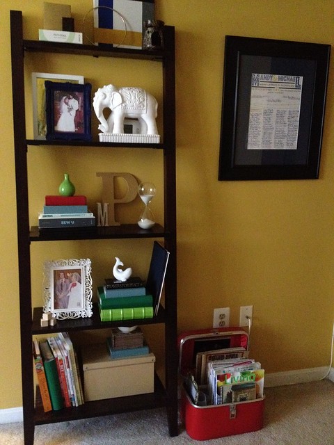
The elephant feels a little visually heavy to me, but that's where our thermostat is and it does a decent job of concealing that while being easy to move out of the way. I don't know. What do you think? Better? Or not? Areas for improvement? Please note that I draw a self-imposed line at covering those books in decorative paper.
find me elsewhere



I like it! If the elephant continues to bother you or seem heavy, maybe just moving it lower so the weight feels grounded would work too!
ReplyDelete