Vignette styling isn’t really my strong suit. I get attractive arrangements when I see them, but I always have a hard time creating them. I think it’s mostly because I buy cute accessories and frames in the right colors and finishes as I see them and then try to make them work in my home. As opposed to buying accessories not only in the right colors and finishes, but also of the right scale and with a context in mind.
Lately, I’ve felt inspired to get my vignettes in order (wow, talk about first world problems…), and I’ve felt particularly inspired by the stylings of Emily Henderson. I mean, seriously, that lady knows how to style a vignette. Every episode of HGTV’s Secrets from a Stylist is packed full of vignettes with such depth and character. Some of my favorites…
Anyway, I’ve been doing lots on the bed-side of the bedroom lately including a nightstand revamp and the addition of some new bedside art. I figured it was time to give a little attention to the opposite side, which doesn’t get much exposure here on the blog both because I am ashamed of our 1999 TV (more first world problems) and the state of the accessories. As you can see, I’m no Emily Henderson.

In my view, the main problem over here was that everything is basically one of two heights, so it just sort of looks like a jumble of stuff. What I felt was really missing was a variation in scale, so I thought I’d bring in some tall art to lean against the wall. (Another wall in the room is now the home for the mirror.)
I picked up a big canvas from the craft store (less than $8 on sale)…
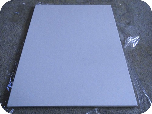
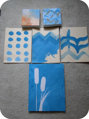
I decided to stick to teal and white, since there’s so much teal going on on the other side of the room. I tried a few things out unsuccessfully on some extra canvases and paper that I had around. Fail after fail.
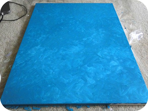
And then I decided to just jump in and see what happened. I started by covering the canvas in teal acrylic paint using a very quick and dirty crosshatch technique.
On top of that, I worked in some white acrylic starting at one end and fading it into the other until I was satisfied that what I had could pass for art. I leaned it up against the wall, edited my other accessories a bit, added and a plant, and voila! I think I’m getting better at this.
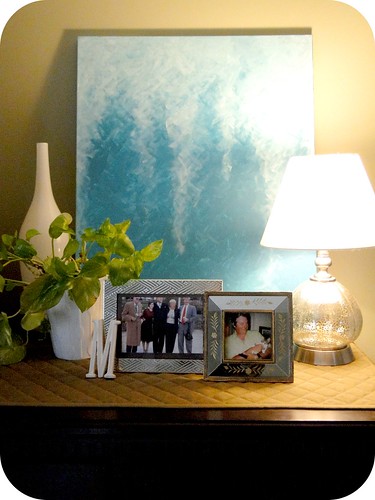
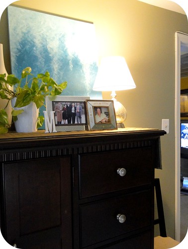
This is a pretty quick, easy, and super cheap project that anyone can do (Michael even declared that he thought he could have painted it). What do you think? Do you ever have problems with vignettes?
---


So cute! I love vignettes as well....particularly changing them with frequency.
ReplyDeleteI really love it! When I first saw the pic, I thought it was your inspiration and I didn't realize it was YOUR art! It looks amazing!
ReplyDeleteI LOVE this post. I can totally relate to having trouble styling. When it's done right it looks so easy, but it so NOT easy! I LOVE your artwork and how you styled the surface. It looks amazing! :)
ReplyDeleteAnd ps. We have a tv that old too. We hide ours in the basement ;)